City of Austin Mobility Services Portal
Improving the Chauffeur Permit Application Experience
Portal Page
Summary
Austin Community College’s Applied UX Lab partnered with the City of Austin to improve the chauffeur permit application in its Mobility Services Portal.
Our challenge was to make a complex permitting process easier to understand while working within City regulations, staff workflows, accessibility requirements, and the constraints of the existing platform.
Role
Content Designer
UX/UI Designer
UX Researcher
Industry
Civic Tech
Duration
Spring 2026 (13 weeks)
Tools
Figma
Miro
Dovetail
Asana
The Problem
The application was only one part of the chauffeur permit process. Applicants also had to complete steps such as fingerprinting, testing, document submission, and in-person requirements.
The City wanted us to improve two things:
make the online application easier to use and understand
better connect the portal to the steps that happened outside it
The portal had undergone extensive internal review, but had not yet been tested with its primary external users.

The chauffeur permit process spans the online portal, City review, a third-party fingerprinting service, and in-person completion.
Research
Methods
Our team conducted 5 user interviews and usability testing with 4 participants. I conducted two interviews, designed the usability study, and conducted one usability test.
I also took the lead on heuristic evaluation and field research, including visits to the Mobility Services Office to understand staff workflows and how online and in-person requirements intersected.
Combining these methods helped me examine the experience from multiple perspectives: what the City required, how the portal communicated those requirements, and how applicants understood and navigated the process.
Recruiting Hard-to-Reach Participants
Finding active chauffeur applicants was difficult, so I expanded recruitment through direct outreach to transportation businesses, drivers, and other industry contacts.

I mapped permitted transportation businesses across Austin to identify locations for direct participant outreach.
Key Findings
Three themes had the strongest influence on my design work:
The service felt fragmented across online and in-person steps
Applicants moved between the portal, email, fingerprinting at the Texas Department of Public Safety, and the Mobility Services Office without always having a clear sense of how the steps connected.
Important guidance was scattered across the portal
Applicants had to piece together requirements presented in different locations and at different stages.
Dense content made required information difficult to scan
Usability testing showed that the amount of text and limited visual hierarchy made a regulatory process feel more difficult than it needed to be.
These findings shaped my design priorities: make the full permit process visible, present requirements when applicants needed them, and make required information easier to understand without compromising compliance.
Content and Interface Design
Making the Full Process Visible
I introduced a Hierarchical Task Analysis to map the tasks and dependencies across the permit process. This helped me understand how the online application connected to requirements and activities outside the portal.
Using that analysis, I created a visual overview connecting the application with fingerprinting, testing, document requirements, and in-person steps.
I chose this approach because applicants needed to understand how the full process fit together, not just navigate individual screens.


Visual: Process overview
Clarifying Requirements and Next Steps
I reorganized scattered guidance around the stage of the process where applicants needed it, broke dense information into manageable sections, and revised language using City of Austin writing guidelines.
Essential instructions remained visible, while detailed regulatory information was moved to clearly labeled links at relevant points in the journey. This reduced information overload while preserving access to the full requirements for compliance.
My goal was to help applicants quickly answer:
Does this apply to me?
What do I need to do now?
What happens next?
Before
After
Visual: Before-and-after content organization
Improving Hierarchy and Readability
Usability testing showed that content density and limited visual hierarchy made the application difficult to scan.
I refined typography, spacing, and content hierarchy to make instructions easier to follow. I also designed the cards to reflect task status: pending steps remained expanded with their instructions visible, while completed steps collapsed and displayed a green checkmark.
This reduced visual clutter as applicants progressed, while keeping the remaining requirements visible and the full process accessible.
Visual: Pending and completed card states.
Mobility Services Home Page

Required Chauffeur Document Modal
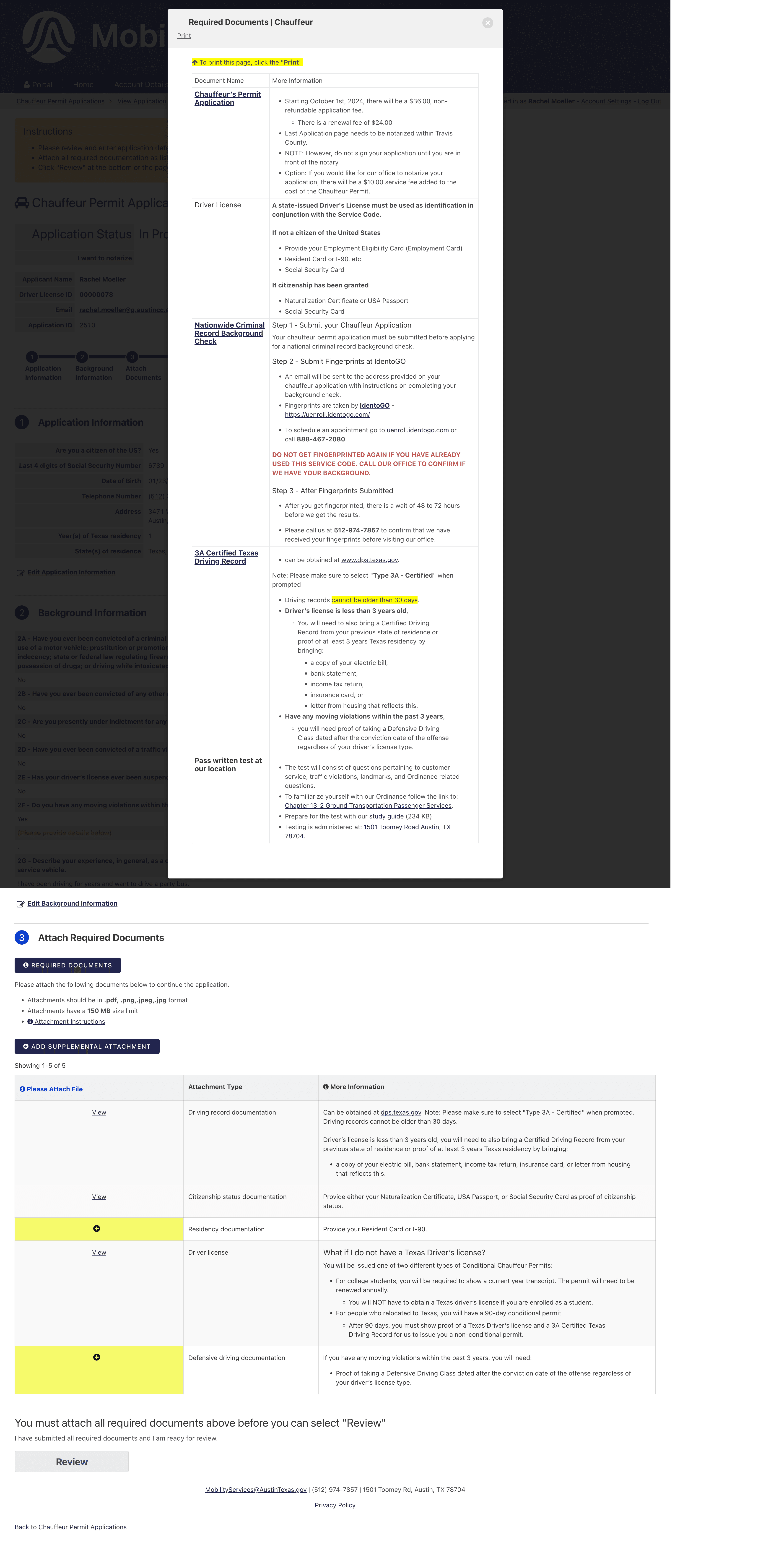
Before redesign
Finding Missing Requirement Flows
Late in the project, I found several missing paths in the document-upload and requirement logic that had not been captured in earlier wireframes.
I mapped the edge cases, reviewed them with the teammate responsible for that part of the flow, and identified which issues we could resolve and which required City clarification.
Because time was limited, I prioritized these higher-risk logic and content issues over polishing every remaining screen. A more visually complete prototype would have been less valuable if applicants could still encounter unclear or incomplete requirement paths.
I used Claude and Lucidchart to explore conditional document requirements and test scenarios missing from our earlier flows. I manually reviewed the output, refined the logic through multiple iterations, and worked with a teammate to confirm which issues we could resolve and which required City clarification.

Visual: Document-flow example
Designing Within Constraints
Our recommendations had to work within:
City regulations and safety requirements
staff workflows
accessibility and content standards
the existing Knack platform
Those constraints shaped our decisions. A cleaner interface was not automatically a better solution if it removed information the City needed to communicate or created additional work for staff.
Some improvements could be implemented within the City’s existing system without additional software costs, while longer-term ideas—such as a mobile application concept—were presented as future opportunities rather than current deliverables.
Outcome
Our team presented our research, designs, and recommendations to approximately 10 City stakeholders and delivered high-fidelity designs, research documentation, and organized handoff files.
I contributed to the final presentation, communicating the implications of our recommendations for the City's operations and responding to stakeholder questions.
Subsequent City feedback identified document uploading as one of the most difficult parts of the application, with approximately 50% of respondents reporting difficulty or frustration. This reinforced the importance of the requirement and document-flow issues I prioritized.
Because implementation was still underway, post-launch outcomes such as application completion rates and staff time saved had not yet been measured.
What I Learned
This project changed how I think about both research and design.
I learned to broaden recruitment sooner when an ideal participant pool is too restrictive, share unfinished work earlier rather than solving too much independently, and prioritize consequential user problems over visual completeness.
Most importantly, I became more interested in the experience between screens.
The permit process crossed systems, people, policies, and physical locations. Improving it required thinking beyond interface design and toward content design, information architecture, and service design.
That became the biggest takeaway from the project: understanding the full service often reveals what the interface actually needs to do.
Emergency Communication in a Public School District
Gaps in clarity, timing, and consistency across a fragmented communication system

Conceptual alert structure exploring clarity, status, and consistency.
Summary
This project began as exploratory research into the Austin Independent School District (AISD) website, with an initial focus on navigation, information clarity, and how people connected to AISD schools locate district resources online.
Early exploration revealed a more urgent communication problem during school emergencies. I narrowed the research focus from website usability to how official emergency information was received, interpreted, and verified across channels during high-stress situations.
Role
UX Researcher
UX Writer
Industry
Public Education
Duration
Fall 2024 (5 weeks)
Tools
Figma
Miro
Google Forms
Context and Stakes
Austin Independent School District (AISD) serves nearly 73,000 students across 116 schools and supports families in more than 100 languages. In a district this large, emergency communication has to work across many audiences, languages, campuses, and channels.
During urgent situations, parents, staff, and nearby community members depend on official updates to understand what is happening, whether students are safe, and what to do next.
Research Approach
I began by reviewing AISD’s public-facing website and communication materials to understand how families were expected to find emergency information.
After narrowing the project scope toward emergency communication, I conducted five semi-structured interviews with AISD parents, staff, and a nearby community member connected to district schools, along with a short survey used to identify recurring patterns across experiences.
The interviews focused on how people received emergency updates, which communication channels they trusted, where confusion occurred, and how they verified information during active situations.
Because I did not have access to district accounts, parent portals, or internal communication systems, the research focused on participant experiences, public-facing materials, and examples of official messaging shared during interviews.
Research Synthesis
After each interview, I transcribed responses and coded recurring themes related to timing, clarity, trust, and how people verified information. I then used affinity mapping to group similar patterns across interviews and survey responses.
Across interviews and survey responses, recurring patterns emerged around timing, trust, status clarity, and how participants verified information during active situations.
That synthesis shifted the research from asking, “Where should emergency information live?” to “How can official communication make changing situations easier to understand?”

Affinity mapping was used to group recurring themes around trust, timing, status clarity, and communication behavior during emergencies.
What People Said
“About a week ago there was a bomb threat at my child’s school ... I found out about it on Facebook.”
— Mother of high school student
“I really couldn’t pinpoint if it had just happened or...was still happening."
— Special education teacher
Findings
Three patterns shaped how participants experienced emergency communication during active situations.
Delayed and Incomplete Updates
Emergency notifications often arrived after incidents had already ended or after information had circulated through other channels. Many people relied on faster sources such as social media, group chats, or direct messages to understand what was happening.

Fragmented Information Systems
Participants pieced together updates across text alerts, robocalls, parent and student portals, the AISD website, social media, and word of mouth. No single source consistently reflected the current status of an incident.
District guidance directs families to check the website during emergencies, yet no real-time updates appeared there during the research period. This reinforced the perception that official channels were difficult to rely on when people needed timely information most.

Unclear Status and Resolution
Many people struggled to tell whether a situation was ongoing, escalating, or resolved. Messages often communicated that something had happened, but did not clearly indicate the current status.
Without clear follow-up updates, families and staff were left waiting, checking other sources, or assuming the situation was over.

Emergency Alert Structure
Current System
Status is embedded within paragraphs
Updates require reading previous messages
Next steps are inconsistent or unclear

Revised Structure
Current status is visible at a glance
Messages can be understood independently
Updates and next steps are easier to scan

Lorem ipsum dolor sit amet, consectetur adipiscing elit. Sed do eiusmod tempor
Recommendations and Opportunities
These recommendations focus on making official emergency communication easier to interpret consistently across systems during active incidents.
Surface Emergency Updates on the Homepage
AISD guidance directs families to check the district website during emergencies. A prominent homepage alert banner or status box could make current updates visible without requiring users to search through emergency-management pages.
Make Emergency Terms Understandable in Context
Terms such as “secure” and “hold” are defined in district materials, but they are not easy to interpret during an incident. Alerts should pair the term with a short plain-language explanation.
Clarify Status Across Updates
Emergency messages should make it clear whether a situation is active, changing, or resolved. Follow-up and resolution messages should use consistent language across text alerts, robocalls, the website, and social media.
To explore the recommendation around message clarity more concretely, I developed a conceptual restructuring of an SMS alert.
What This Research Revealed
This project began as a broad exploration of information clarity within a public school district, but the research revealed a more specific systems problem: during emergencies, people were often left interpreting fragmented and evolving information under pressure.
The conversation revealed that the broader issue was not just finding information, but understanding which information was current and trustworthy during emergencies.
The issue was not simply whether communication existed, but whether official updates could function as a trusted source during rapidly changing situations.
Emergency Communication in a Public School District
Gaps in clarity, timing, and consistency across a fragmented communication system
Summary
This project began as exploratory research into the Austin Independent School District (AISD) website, with an initial focus on navigation, information clarity, and how people connected to AISD schools locate district resources online.
Early exploration revealed a more urgent communication problem during school emergencies. I narrowed the research focus from website usability to how official emergency information was received, interpreted, and verified across channels during high-stress situations.
Role
UX Researcher
Industry
Public Education
Duration
Fall 2024 (5 weeks)
Tools
Figma
Miro
Google Forms
Context and Stakes
Austin Independent School District (AISD) serves nearly 73,000 students across 116 schools and supports families in more than 100 languages. In a district this large, emergency communication has to work across many audiences, languages, campuses, and channels.
During urgent situations, parents, staff, and nearby community members depend on official updates to understand what is happening, whether students are safe, and what to do next.
Research Approach
I began by reviewing AISD’s public-facing website and communication materials to understand how families were expected to find emergency information.
After narrowing the project scope toward emergency communication, I conducted five semi-structured interviews with AISD parents, staff, and a nearby community member connected to district schools, along with a short survey used to identify recurring patterns across experiences.
The interviews focused on how people received emergency updates, which communication channels they trusted, where confusion occurred, and how they verified information during active situations.
Because I did not have access to district accounts, parent portals, or internal communication systems, the research focused on participant experiences, public-facing materials, and examples of official messaging shared during interviews.
Research Synthesis
After each interview, I transcribed responses and coded recurring themes related to timing, clarity, trust, and how people verified information. I then used affinity mapping to group similar patterns across interviews and survey responses.
Across interviews and survey responses, recurring patterns emerged around timing, trust, status clarity, and how participants verified information during active situations.
That synthesis shifted the research from asking, “Where should emergency information live?” to “How can official communication make changing situations easier to understand?”


Affinity mapping was used to group recurring themes around trust, timing, status clarity, and communication behavior during emergencies.
What People Said
“About a week ago there was a bomb threat at my child’s school ... I found out about it on Facebook.”
— Mother of high school student
“I really couldn’t pinpoint if it had just happened or...was still happening."
— Special education teacher
Findings
Three patterns shaped how participants experienced emergency communication during active situations.
Delayed and Incomplete Updates
Emergency notifications often arrived after incidents had already ended or after information had circulated through other channels. Many people relied on faster sources such as social media, group chats, or direct messages to understand what was happening.
Fragmented Information Systems
Participants pieced together updates across text alerts, robocalls, parent and student portals, the AISD website, social media, and word of mouth. No single source consistently reflected the current status of an incident.
District guidance directs families to check the website during emergencies, yet no real-time updates appeared there during the research period. This reinforced the perception that official channels were difficult to rely on when people needed timely information most.
Unclear Status and Resolution
Many people struggled to tell whether a situation was ongoing, escalating, or resolved. Messages often communicated that something had happened, but did not clearly indicate the current status.
Without clear follow-up updates, families and staff were left waiting, checking other sources, or assuming the situation was over.
Insight
The issue was not simply whether emergency communication existed, but whether official updates could function as a clear and trusted source during rapidly changing situations.
As uncertainty increased, participants had to cross-check information across multiple systems, social networks, and personal contacts to understand what was happening in real time.
This made emergency communication feel less like a coordinated system and more like something users had to actively reconstruct for themselves.
Emergency Alert Structure
Current System
Status is embedded within paragraphs
Updates require reading previous messages
Next steps are inconsistent or unclear
Revised Structure
Current status is visible at a glance
Messages can be understood independently
Updates and next steps are easier to scan
Recommendations and Opportunities
These recommendations focus on making official emergency communication easier to interpret consistently across systems during active incidents.
Surface Emergency Updates on the Homepage
AISD guidance directs families to check the district website during emergencies. A prominent homepage alert banner or status box could make current updates visible without requiring users to search through emergency-management pages.
Make Emergency Terms Understandable in Context
Terms such as “secure” and “hold” are defined in district materials, but they are not easy to interpret during an incident. Alerts should pair the term with a short plain-language explanation.
Clarify Status Across Updates
Emergency messages should make it clear whether a situation is active, changing, or resolved. Follow-up and resolution messages should use consistent language across text alerts, robocalls, the website, and social media.
To explore the recommendation around message clarity more concretely, I developed a conceptual restructuring of an SMS alert.
What This Research Revealed
This project began as a broad exploration of information clarity within a public school district, but the research revealed a more specific systems problem: during emergencies, people were often left interpreting fragmented and evolving information under pressure.
The conversation revealed that the broader issue was not just finding information, but understanding which information was current and trustworthy during emergencies.
The issue was not simply whether communication existed, but whether official updates could function as a trusted source during rapidly changing situations.
© 2026 by Rachel Moeller
© 2026 by Rachel Moeller
© 2026 by Rachel Moeller