DeviantArt Streaming
DeviantArt Streaming
DeviantArt Streaming
Adapting a Creative Brand for Multi-Platform Streaming
Adapting a Creative Brand for Multi-Platform Streaming
Adapting a Creative Brand for Multi-Platform Streaming

TV browse screen adapting DeviantArt's brand system for large-screen navigation.
TV browse screen adapting DeviantArt's brand system for large-screen navigation.
TV browse screen adapting DeviantArt's brand system for large-screen navigation.
Summary
Summary
Summary
I designed a conceptual streaming video service for DeviantArt, adapting its rebranded visual identity across two distinct platforms: a remote-controlled smart TV app and a mobile (portrait) app. The project aimed to balance artistic personality with platform-specific usability, reinforcing DeviantArt’s brand voice while delivering intuitive navigation and clean UX.
I designed a conceptual streaming video service for DeviantArt, adapting its rebranded visual identity across two distinct platforms: a remote-controlled smart TV app and a mobile (portrait) app. The project aimed to balance artistic personality with platform-specific usability, reinforcing DeviantArt’s brand voice while delivering intuitive navigation and clean UX.
I designed a conceptual streaming video service for DeviantArt, adapting its rebranded visual identity across two distinct platforms: a remote-controlled smart TV app and a mobile (portrait) app. The project aimed to balance artistic personality with platform-specific usability, reinforcing DeviantArt’s brand voice while delivering intuitive navigation and clean UX.
Role
UX Researcher
Industry
Public Education
Duration
Fall 2024 (5 weeks)
Tools
Figma
Miro
Google Forms
Role
Visual Designer
UX Designer
Industry
Media & Entertainment
Duration
October 2024 (3 weeks)
Tools
Figma
Adobe Photoshop
Adobe Illustrator
Role
Visual Designer
UX Designer
Industry
Media & Entertainment
Duration
October 2024 (3 weeks)
Tools
Figma
Adobe Photoshop
Adobe Illustrator
Design Problem
Design Problem
Design Problem
DeviantArt’s visual identity is bold and expressive, but translating that personality into a streaming product required more than applying colors or type. The core problem was creating an experience that still felt like DeviantArt while functioning well across two very different platforms: touch-based mobile screens and remote-controlled TV interfaces. The design needed to balance brand character with clarity, readability, and platform-specific interaction patterns.
DeviantArt’s visual identity is bold and expressive, but translating that personality into a streaming product required more than applying colors or type. The core problem was creating an experience that still felt like DeviantArt while functioning well across two very different platforms: touch-based mobile screens and remote-controlled TV interfaces. The design needed to balance brand character with clarity, readability, and platform-specific interaction patterns.
DeviantArt’s visual identity is bold and expressive, but translating that personality into a streaming product required more than applying colors or type. The core problem was creating an experience that still felt like DeviantArt while functioning well across two very different platforms: touch-based mobile screens and remote-controlled TV interfaces. The design needed to balance brand character with clarity, readability, and platform-specific interaction patterns.
Research
Research
Research
I reviewed leading streaming platforms such as Netflix, Hulu, and YouTube to understand how navigation, hierarchy, and content browsing differ between mobile and TV. Mobile interfaces rely on vertical browsing, clear hierarchy, and straightforward tap targets, while TV interfaces depend on large, consistent grids, minimal on-screen text, and predictable directional movement for remote control navigation. I also examined DeviantArt’s brand guidelines to understand the visual tone, typography, and contrast expectations I needed to carry into both platforms.
I reviewed leading streaming platforms such as Netflix, Hulu, and YouTube to understand how navigation, hierarchy, and content browsing differ between mobile and TV. Mobile interfaces rely on vertical browsing, clear hierarchy, and straightforward tap targets, while TV interfaces depend on large, consistent grids, minimal on-screen text, and predictable directional movement for remote control navigation. I also examined DeviantArt’s brand guidelines to understand the visual tone, typography, and contrast expectations I needed to carry into both platforms.
I reviewed leading streaming platforms such as Netflix, Hulu, and YouTube to understand how navigation, hierarchy, and content browsing differ between mobile and TV. Mobile interfaces rely on vertical browsing, clear hierarchy, and straightforward tap targets, while TV interfaces depend on large, consistent grids, minimal on-screen text, and predictable directional movement for remote control navigation. I also examined DeviantArt’s brand guidelines to understand the visual tone, typography, and contrast expectations I needed to carry into both platforms.

Clockwise from top left: DeviantArt logo, mood board, icons, and browse screen.
Clockwise from top left: DeviantArt logo, mood board, icons, and browse screen.
Clockwise from top left: DeviantArt logo, mood board, icons, and browse screen.
Key Platform Adjustments
Key Platform Adjustments
Key Platform Adjustments
Designing for both mobile and TV required rethinking core UI patterns rather than resizing layouts. Several changes shaped the final system.
Designing for both mobile and TV required rethinking core UI patterns rather than resizing layouts. Several changes shaped the final system.
Designing for both mobile and TV required rethinking core UI patterns rather than resizing layouts. Several changes shaped the final system.
Mobile
Mobile
Mobile
The early mobile screens felt visually dense. Simplifying them improved clarity: consistent thumbnail sizes, accessible genre chips, clearer type hierarchy, and more predictable CTAs. These changes created a touch-friendly layout without losing DeviantArt’s visual personality.
The early mobile screens felt visually dense. Simplifying them improved clarity: consistent thumbnail sizes, accessible genre chips, clearer type hierarchy, and more predictable CTAs. These changes created a touch-friendly layout without losing DeviantArt’s visual personality.
The early mobile screens felt visually dense. Simplifying them improved clarity: consistent thumbnail sizes, accessible genre chips, clearer type hierarchy, and more predictable CTAs. These changes created a touch-friendly layout without losing DeviantArt’s visual personality.
TV
TV
TV
TV required a shift to remote-first navigation. A 6-column grid, larger type, wider safe areas, and reduced on-screen text supported long-distance readability. The search screen and focus states were rebuilt around standard TV interaction models.
TV required a shift to remote-first navigation. A 6-column grid, larger type, wider safe areas, and reduced on-screen text supported long-distance readability. The search screen and focus states were rebuilt around standard TV interaction models.
TV required a shift to remote-first navigation. A 6-column grid, larger type, wider safe areas, and reduced on-screen text supported long-distance readability. The search screen and focus states were rebuilt around standard TV interaction models.
Metadata & Labels
Metadata & Labels
Metadata & Labels
Section labels and content details often competed visually. Consolidating metadata, adjusting spacing, and using gradients when needed improved readability across both platforms.
Section labels and content details often competed visually. Consolidating metadata, adjusting spacing, and using gradients when needed improved readability across both platforms.
Section labels and content details often competed visually. Consolidating metadata, adjusting spacing, and using gradients when needed improved readability across both platforms.
Playback & Progress
Playback & Progress
Playback & Progress
Playback elements needed device-specific treatment: compact controls for mobile, simplified horizontal progress and larger entry points for TV. This aligned both versions with streaming norms.
Playback elements needed device-specific treatment: compact controls for mobile, simplified horizontal progress and larger entry points for TV. This aligned both versions with streaming norms.
Playback elements needed device-specific treatment: compact controls for mobile, simplified horizontal progress and larger entry points for TV. This aligned both versions with streaming norms.
Final Deliverables
Final Deliverables
Final Deliverables
Mobile App Screens: Home, Search, Video Detail
Smart TV Screens: Home, Search, Video Detail (designed for 1920x1080px)
Interactive Figma prototype demonstrating remote vs. touch navigation flows
System documentation outlining component behaviors, visual styles, and platform adjustments
Mobile App Screens: Home, Search, Video Detail
Smart TV Screens: Home, Search, Video Detail (designed for 1920x1080px)
Interactive Figma prototype demonstrating remote vs. touch navigation flows
System documentation outlining component behaviors, visual styles, and platform adjustments
Mobile App Screens: Home, Search, Video Detail
Smart TV Screens: Home, Search, Video Detail (designed for 1920x1080px)
Interactive Figma prototype demonstrating remote vs. touch navigation flows
System documentation outlining component behaviors, visual styles, and platform adjustments


Mobile search results. movie detail, and resume watching screens.
Mobile search results. movie detail, and resume watching screens.
Mobile search results. movie detail, and resume watching screens.

Browse screen showing the final TV grid and focus behavior.
Browse screen showing the final TV grid and focus behavior.
Browse screen showing the final TV grid and focus behavior.
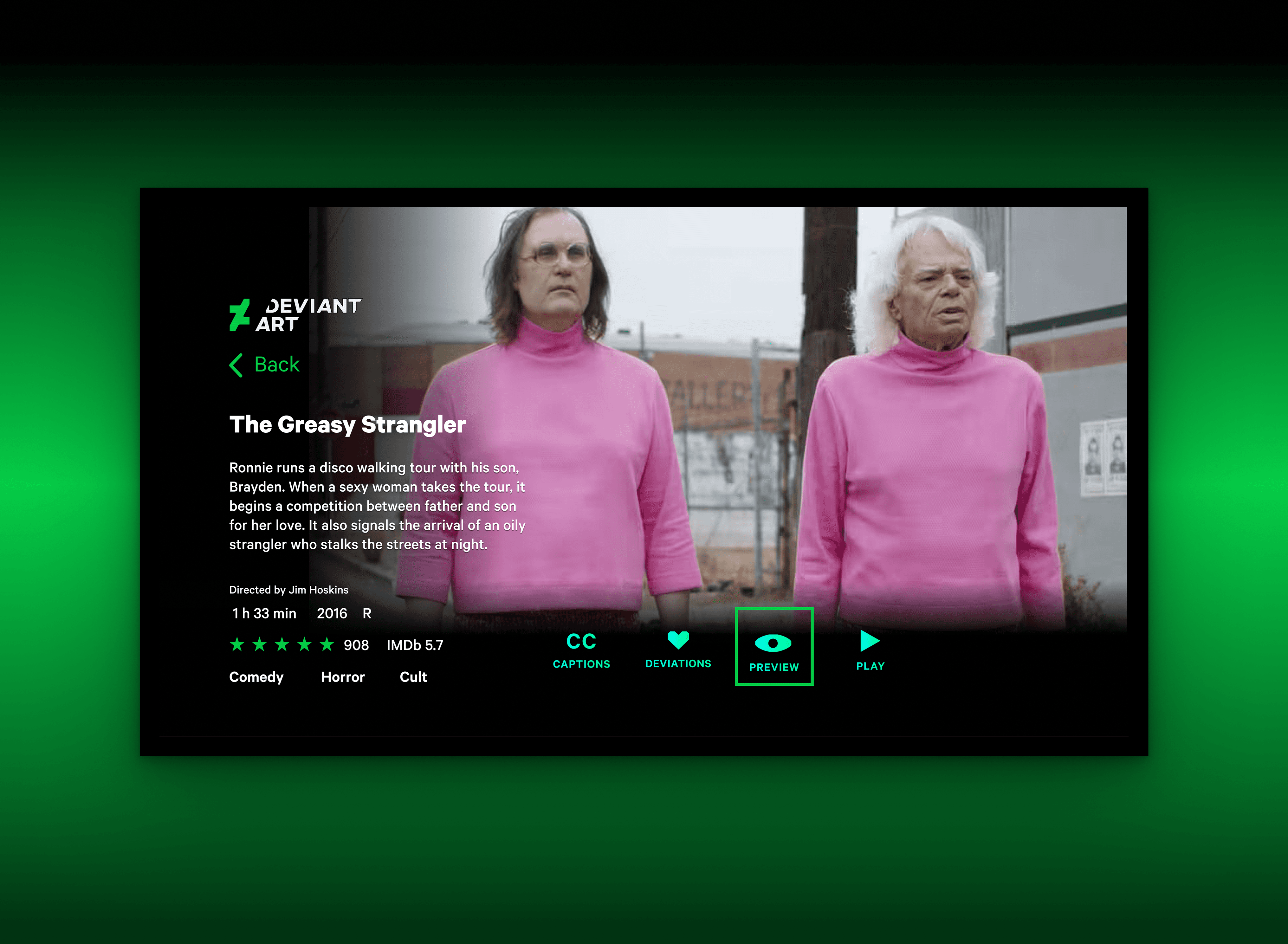
Detail screen with simplified metadata and TV-optimized actions.
Detail screen with simplified metadata and TV-optimized actions.
Detail screen with simplified metadata and TV-optimized actions.

Resume view with progress indicator and Up Next module.
Resume view with progress indicator and Up Next module.
Resume view with progress indicator and Up Next module.
Reflections
Reflections
Reflections
Balancing visual cohesion with the divergent needs of two input models
Scaling brand voice without overwhelming small screens or distant TV viewers
Designing intuitive flows for a fictional product without real user data
Balancing visual cohesion with the divergent needs of two input models
Scaling brand voice without overwhelming small screens or distant TV viewers
Designing intuitive flows for a fictional product without real user data
Balancing visual cohesion with the divergent needs of two input models
Scaling brand voice without overwhelming small screens or distant TV viewers
Designing intuitive flows for a fictional product without real user data
Working across mobile and TV made it difficult to maintain visual cohesion while supporting two very different interaction patterns. Applying DeviantArt’s expressive brand style without overwhelming small screens or distant TV viewers also required careful adjustments to hierarchy and contrast. Designing for a fictional product added another layer of complexity, since there was no real user data to rely on and decisions had to be grounded in pattern research.
Working across mobile and TV made it difficult to maintain visual cohesion while supporting two very different interaction patterns. Applying DeviantArt’s expressive brand style without overwhelming small screens or distant TV viewers also required careful adjustments to hierarchy and contrast. Designing for a fictional product added another layer of complexity, since there was no real user data to rely on and decisions had to be grounded in pattern research.
Working across mobile and TV made it difficult to maintain visual cohesion while supporting two very different interaction patterns. Applying DeviantArt’s expressive brand style without overwhelming small screens or distant TV viewers also required careful adjustments to hierarchy and contrast. Designing for a fictional product added another layer of complexity, since there was no real user data to rely on and decisions had to be grounded in pattern research.
Next Steps
Next Steps
Next Steps
If expanded further, the system could include:
If expanded further, the system could include:
If expanded further, the system could include:
Working across mobile and TV made it difficult to maintain visual cohesion while supporting two very different interaction patterns. Applying DeviantArt’s expressive brand style without overwhelming small screens or distant TV viewers also required careful adjustments to hierarchy and contrast. Designing for a fictional product added another layer of complexity, since there was no real user data to rely on and decisions had to be grounded in pattern research.
Working across mobile and TV made it difficult to maintain visual cohesion while supporting two very different interaction patterns. Applying DeviantArt’s expressive brand style without overwhelming small screens or distant TV viewers also required careful adjustments to hierarchy and contrast. Designing for a fictional product added another layer of complexity, since there was no real user data to rely on and decisions had to be grounded in pattern research.
Working across mobile and TV made it difficult to maintain visual cohesion while supporting two very different interaction patterns. Applying DeviantArt’s expressive brand style without overwhelming small screens or distant TV viewers also required careful adjustments to hierarchy and contrast. Designing for a fictional product added another layer of complexity, since there was no real user data to rely on and decisions had to be grounded in pattern research.
© 2026 by Rachel Moeller
© 2026 by Rachel Moeller
© 2026 by Rachel Moeller