Scalable E-Commerce Platform
Designing a Mobile Checkout Experience with Atomic Design

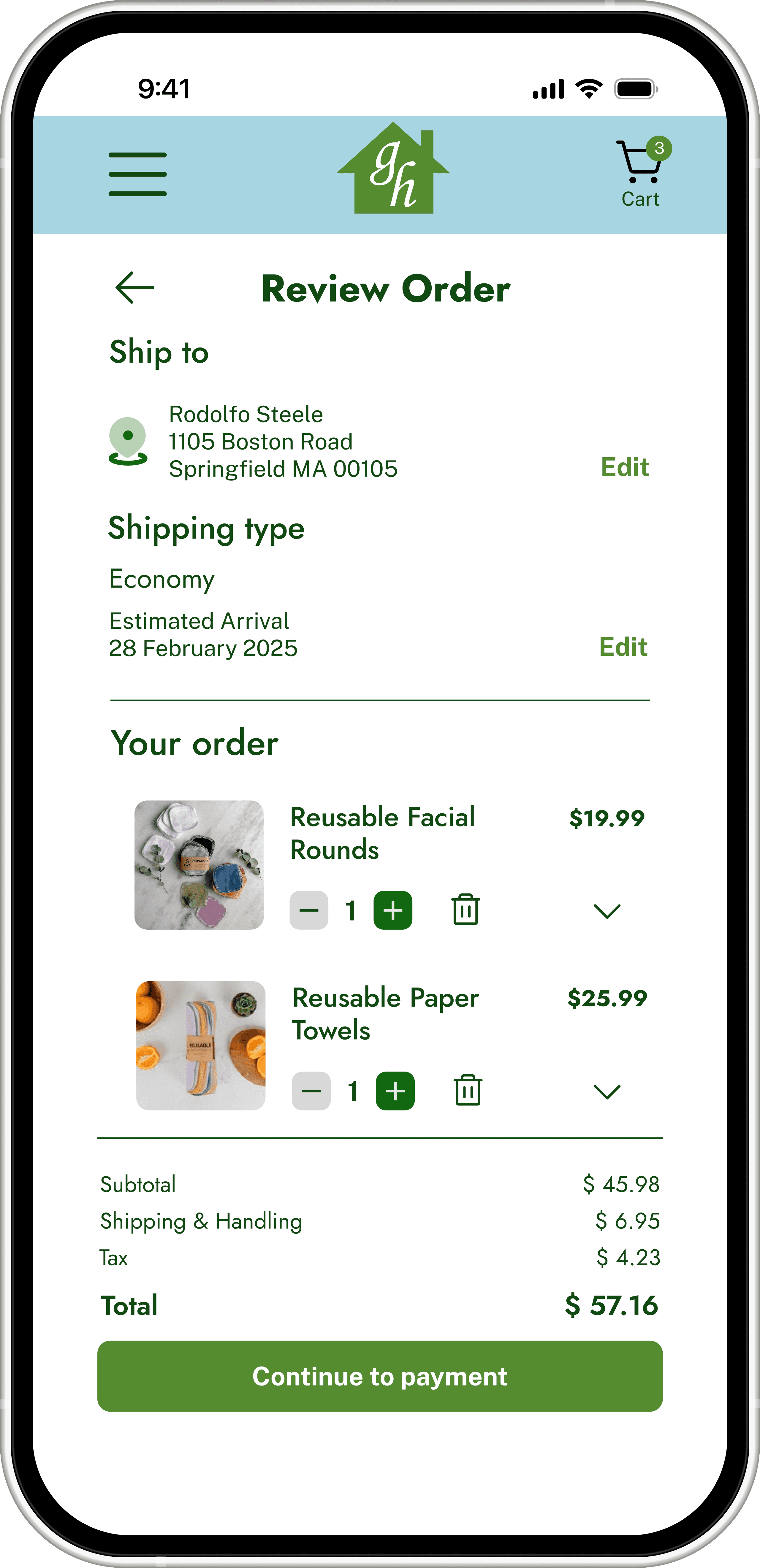


Mobile product detail and checkout screens

Mobile product detail and checkout screens
Summary
I designed a modular atomic system and mobile checkout flow for Greenerly Home, a fictional sustainable home goods brand. The MVP included cart, shipping, payment, and confirmation screens built around clarity, consistency, and user confidence.
Role
Visual Designer
UX Designer
UX Researcher
Industry
Sustainable Home Goods
Duration
October 2024 (3 weeks)
Tools
Figma
Adobe Photoshop
Adobe Illustrator
Design Problem
Create a branded, reusable mobile checkout system for eco-conscious consumers aged 25 to 50, balancing simplicity, trust, and accessibility within the constraints of a small team (2 people) and a short timeline.
User Needs
Move through checkout without friction or confusion
Understand each step through clear visual hierarchy
Feel confident through visible progress cues and consistent visuals
Business Needs
A flexible, scalable atomic system to support future features like browsing and saved items
A brand-aligned MVP that serves as a design and development foundation
Research
Competitive research into eco-friendly brands and e-commerce checkout flows revealed consistent patterns in clarity, structure, and trust cues. We used these to guide a clean, modular component set that can scale to future flows.
Simple, modular components for scalable growth
Trust-building visual clarity (e.g., clear CTAs, clean inputs, reassuring microcopy)
Strong information hierarchy to guide users step by step
Creative Approach
My teammate and I divided work intentionally. I concentrated on component structure and visual cohesion across atoms, molecules, and organisms, including spacing, typography, and interaction states. My teammate concentrated on task flows and wireframes and refined the page-level layout. We reviewed decisions together and both contributed to user testing.
Foundational Work
Defined atomic design tokens: color palette, typography, and spacing rules
Created atoms (buttons, input fields, eco-themed icons)
Built molecules (form sections, add-to-cart blocks, review stars)
Assembled organisms (checkout forms, product cards, promo code blocks)
Templates and Mid-Fidelity Screens
We developed product, checkout, and confirmation screens using reusable components and clear hierarchy. Persistent CTAs, totals, and progress indicators created familiarity and made next steps easy to identify.
Product detail page: hero image, sustainability badges, pricing, reviews
Checkout flow: shipping, payment, review, confirmation (with progress indicators)
About page: mission-driven storytelling, eco-certifications, testimonials
Typography


Mobile-optimized type scale using Jost and Public Sans for clarity and readability.
Brand Colors


Core brand color system supporting accessibility and visual consistency.
Atoms & Molecules


Foundational UI atom and molecule components used across the product for consistency and scalability.
Templates

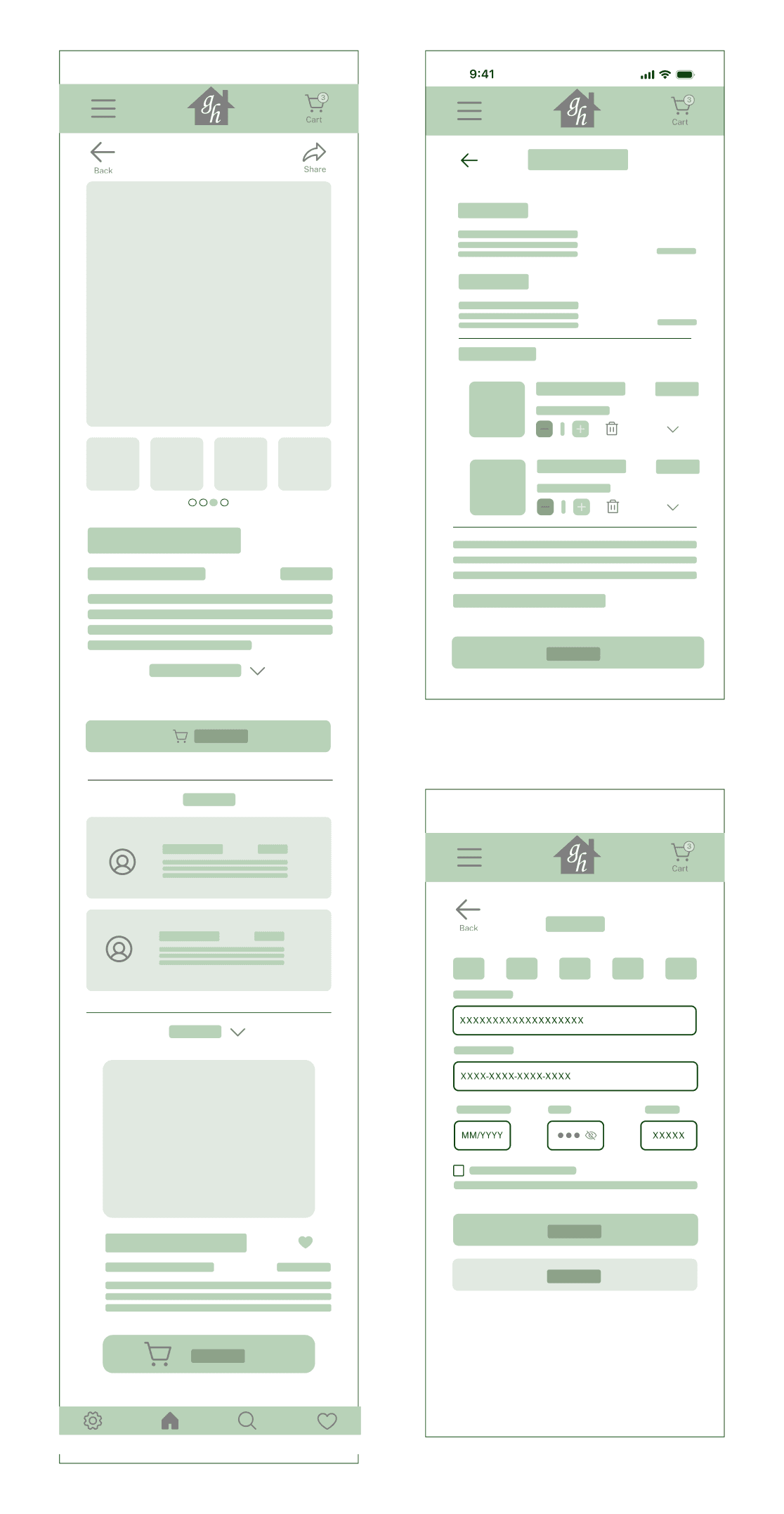

Wireframes combine smaller components to lay out pages.
User Testing
We tested mockups with two users (ages 34 and 77)
Gathered feedback on clarity, icon readability, button labeling, progress flow
Revised CTAs (“Explore More” changed to “Shop Greener Products”), enlarged icon sizes, adjusted spacing for better mobile readability
Testing confirmed that reassurance cues such as visible totals, progress indicators, and confirmation states were as valuable as aesthetics. Predictable hierarchy and consistent feedback strengthened usability and user confidence.
Revisions
During refinement, I adjusted the type hierarchy to better suit mobile.
The original scale had too much contrast between headings and body text, which made product lists and cards feel unbalanced.
I simplified the type levels and reduced jump ratios to improve readability and consistency.
Final Deliverables
During refinement, I adjusted the type hierarchy to better suit mobile.
The original scale had too much contrast between headings and body text, which made product lists and cards feel unbalanced.
I simplified the type levels and reduced jump ratios to improve readability and consistency.


High-fidelity pages assembled from reusable system components.
Project Challenges
As we began building the system, two challenges shaped our direction. First, working asynchronously slowed early alignment on grid and component structure. Second, the original type scale created visual imbalance on mobile, forcing us to rethink hierarchy before moving forward.
Reflections
This project showed me how much structure and collaboration influence the final outcome. Working mostly asynchronously meant we had to stay aligned on priorities, which wasn’t always perfect, but it pushed me to focus on essential components and keep scope in check.
User testing highlighted how small choices in type scale, spacing, and feedback affect clarity, especially on mobile. Adjusting those details made the flow feel more readable and predictable for different users.
A few challenges shaped the work, like balancing brand tone with accessibility and managing time while building a system from the ground up. Atomic design helped steady the process by giving us a flexible structure to iterate within. Overall, the project strengthened my understanding of how system thinking and collaboration support clearer, more dependable user experiences.
Next Steps
Conduct accessibility testing
Expand the system for browsing and account features
Add motion and micro interactions to show system feedback
Scalable E-Commerce Platform
Designing a Mobile Checkout Experience with Atomic Design
Mobile product detail and checkout screens
Summary
I designed a modular atomic system and mobile checkout flow for Greenerly Home, a fictional sustainable home goods brand. The MVP included cart, shipping, payment, and confirmation screens built around clarity, consistency, and user confidence.
Role
Visual Designer
UX Designer
UX Researcher
Industry
E-Commerce / Home Goods
Duration
October 2024 (3 weeks)
Tools
Figma
Adobe Photoshop
Adobe Illustrator
Design Problem
Create a branded, reusable mobile checkout system for eco-conscious consumers aged 25 to 50, balancing simplicity, trust, and accessibility within the constraints of a small team (2 people) and a short timeline.
User Needs
Move through checkout without friction or confusion
Understand each step through clear visual hierarchy
Feel confident through visible progress cues and consistent visuals
Business Needs
A flexible, scalable atomic system to support future features like browsing and saved items
A brand-aligned MVP that serves as a design and development foundation
Research
Competitive research into eco-friendly brands and e-commerce checkout flows revealed consistent patterns in clarity, structure, and trust cues. We used these to guide a clean, modular component set that can scale to future flows.
Simple, modular components for scalable growth
Trust-building visual clarity (e.g., clear CTAs, clean inputs, reassuring microcopy)
Strong information hierarchy to guide users step by step
Creative Approach
My teammate and I divided work intentionally. I concentrated on component structure and visual cohesion across atoms, molecules, and organisms, including spacing, typography, and interaction states. My teammate concentrated on task flows and wireframes and refined the page-level layout. We reviewed decisions together and both contributed to user testing.
Foundational Work
Defined atomic design tokens: color palette, typography, and spacing rules
Created atoms (buttons, input fields, eco-themed icons)
Built molecules (form sections, add-to-cart blocks, review stars)
Assembled organisms (checkout forms, product cards, promo code blocks)
Templates and Mid-Fidelity Screens
We developed product, checkout, and confirmation screens using reusable components and clear hierarchy.
Persistent CTAs, totals, and progress indicators created familiarity and made next steps easy to identify.
Product detail page: hero image, sustainability badges, pricing, reviews
Checkout flow: shipping, payment, review, confirmation (with progress indicators)
About page: mission-driven storytelling, eco-certifications, testimonials
Typography
Mobile-optimized type scale using Jost and Public Sans for clarity and readability.
Brand Colors
Core brand color system supporting accessibility and visual consistency.
Atoms & Molecules
Foundational UI atom and molecule components used across the product for consistency and scalability.
Templates
Wireframes combine smaller components to lay out pages.
User Testing
We tested mockups with two users (ages 34 and 77)
Gathered feedback on clarity, icon readability, button labeling, progress flow
Revised CTAs (“Explore More” changed to “Shop Greener Products”), enlarged icon sizes, adjusted spacing for better mobile readability
Testing confirmed that reassurance cues such as visible totals, progress indicators, and confirmation states were as valuable as aesthetics. Predictable hierarchy and consistent feedback strengthened usability and user confidence.
Revisions
Scalable Atomic Design System: With tokens and reusable components
Mobile Checkout Flow: Shopping, payment, and confirmation screens
User Testing Summary: Findings from sessions with two age groups
Annotated Figma File: Documentation and developer handoff notes
Final Deliverables
Scalable Atomic Design System: With tokens and reusable components
Mobile Checkout Flow: Shopping, payment, and confirmation screens
User Testing Summary: Findings from sessions with two age groups
Annotated Figma File: Documentation and developer handoff notes
High-fidelity pages assembled from reusable system components.
Reflections
This project showed me how much structure and collaboration influence the final outcome. Working mostly asynchronously meant we had to stay aligned on priorities, which wasn’t always perfect, but it pushed me to focus on essential components and keep scope in check.
User testing highlighted how small choices in type scale, spacing, and feedback affect clarity, especially on mobile. Adjusting those details made the flow feel more readable and predictable for different users.
A few challenges shaped the work, like balancing brand tone with accessibility and managing time while building a system from the ground up. Atomic design helped steady the process by giving us a flexible structure to iterate within. Overall, the project strengthened my understanding of how system thinking and collaboration support clearer, more dependable user experiences.
Project Challenges
As we began building the system, two challenges shaped our direction. First, working asynchronously slowed early alignment on grid and component structure. Second, the original type scale created visual imbalance on mobile, forcing us to rethink hierarchy before moving forward.
Next Steps
Conduct accessibility testing
Expand the system for browsing and account features
Add motion and micro interactions to show system feedback
Scalable E-Commerce Platform
Designing a Mobile Checkout Experience with Atomic Design
Mobile product detail and checkout screens
Summary
I designed a modular atomic system and mobile checkout flow for Greenerly Home, a fictional sustainable home goods brand. The MVP included cart, shipping, payment, and confirmation screens built around clarity, consistency, and user confidence.
Role
Visual Designer
UX Designer
UX Researcher
Tools
Figma
Adobe Photoshop
Adobe Illustrator
Industry
Sustainable Home Goods
Duration
October 2024 (3 weeks)
Design Problem
Create a branded, reusable mobile checkout system for eco-conscious consumers aged 25 to 50, balancing simplicity, trust, and accessibility within the constraints of a small team (2 people) and a short timeline.
User Needs
Move through checkout without friction or confusion
Understand each step through clear visual hierarchy
Feel confident through visible progress cues and consistent visuals
Business Needs
A flexible, scalable atomic system to support future features like browsing and saved items
A brand-aligned MVP that serves as a design and development foundation
Research
Simple, modular components for scalable growth
Trust-building visual clarity (e.g., clear CTAs, clean inputs, reassuring microcopy)
Strong information hierarchy to guide users step by step
Competitive research into eco-friendly brands and e-commerce checkout flows revealed consistent patterns in clarity, structure, and trust cues. We used these to guide a clean, modular component set that can scale to future flows.
Creative Approach
My teammate and I divided work intentionally. I concentrated on component structure and visual cohesion across atoms, molecules, and organisms, including spacing, typography, and interaction states. My teammate concentrated on task flows and wireframes and refined the page-level layout. We reviewed decisions together and both contributed to user testing.
Foundational Work
Defined atomic design tokens: color palette, typography, and spacing rules
Created atoms (buttons, input fields, eco-themed icons)
Built molecules (form sections, add-to-cart blocks, review stars)
Assembled organisms (checkout forms, product cards, promo code blocks)
Templates and Mid-Fidelity Screens
We developed product, checkout, and confirmation screens using reusable components and clear hierarchy. Persistent CTAs, totals, and progress indicators created familiarity and made next steps easy to identify.
Product detail page: hero image, sustainability badges, pricing, reviews
Checkout flow: shipping, payment, review, confirmation (with progress indicators)
About page: mission-driven storytelling, eco-certifications, testimonials
Typography
Mobile-optimized type scale using Jost and Public Sans for clarity and readability.
Brand Colors
Core brand color system supporting accessibility and visual consistency.
Atoms & Molecules
Foundational UI atom and molecule components used across the product for consistency and scalability.
Templates
Wireframes combine smaller components to lay out pages.
User Testing
We tested mockups with two users (ages 34 and 77)
Gathered feedback on clarity, icon readability, button labeling, progress flow
Revised CTAs (“Explore More” changed to “Shop Greener Products”), enlarged icon sizes, adjusted spacing for better mobile readability
Testing confirmed that reassurance cues such as visible totals, progress indicators, and confirmation states were as valuable as aesthetics. Predictable hierarchy and consistent feedback strengthened usability and user confidence.
Revisions
During refinement, I adjusted the type hierarchy to better suit mobile.
The original scale had too much contrast between headings and body text, which made product lists and cards feel unbalanced.
I simplified the type levels and reduced jump ratios to improve readability and consistency.
Project Challenges
As we began building the system, two challenges shaped our direction. First, working asynchronously slowed early alignment on grid and component structure. Second, the original type scale created visual imbalance on mobile, forcing us to rethink hierarchy before moving forward.
Final Deliverables
Scalable Atomic Design System: With tokens and reusable components
Mobile Checkout Flow: Shopping, payment, and confirmation screens
User Testing Summary: Findings from sessions with two age groups
Annotated Figma File: Documentation and developer handoff notes
Testing confirmed that reassurance cues such as visible totals, progress indicators, and confirmation states were as valuable as aesthetics. Predictable hierarchy and consistent feedback strengthened usability and user confidence.
High-fidelity pages assembled from reusable system components.
Reflections
This project showed me how much structure and collaboration influence the final outcome. Working mostly asynchronously meant we had to stay aligned on priorities, which wasn’t always perfect, but it pushed me to focus on essential components and keep scope in check.
User testing highlighted how small choices in type scale, spacing, and feedback affect clarity, especially on mobile. Adjusting those details made the flow feel more readable and predictable for different users.
A few challenges shaped the work, like balancing brand tone with accessibility and managing time while building a system from the ground up. Atomic design helped steady the process by giving us a flexible structure to iterate within. Overall, the project strengthened my understanding of how system thinking and collaboration support clearer, more dependable user experiences.
Next Steps
Conduct accessibility testing
Expand the system for browsing and account features
Add motion and micro interactions to show system feedback
© 2026 by Rachel Moeller
© 2026 by Rachel Moeller
© 2026 by Rachel Moeller